


|
Dashboard Design
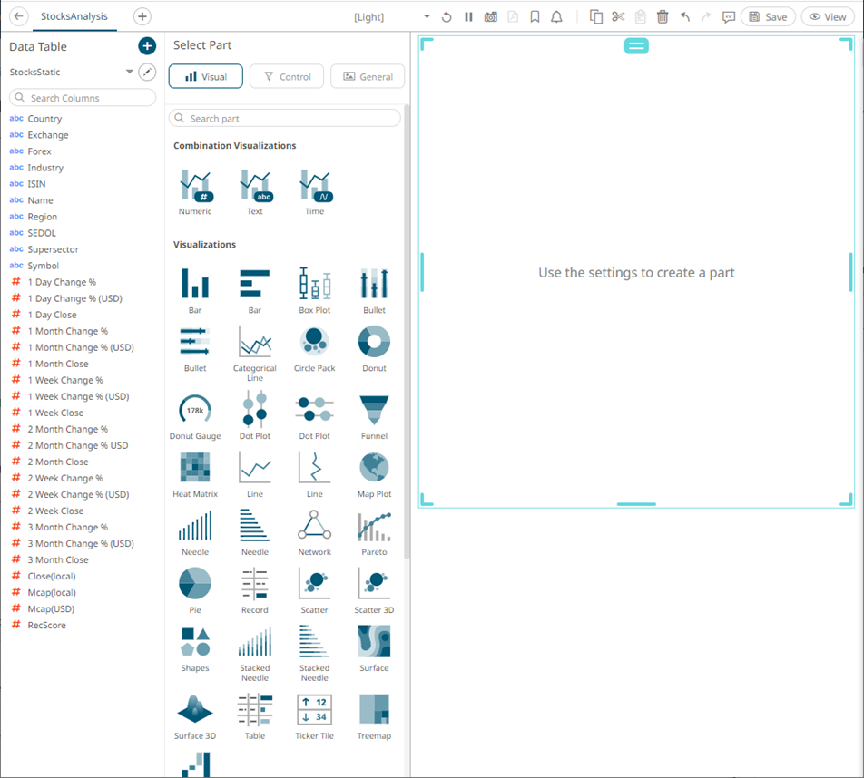
Before you can perform the other dashboard settings, you must first add visualizations, controls, or general parts on the dashboard.
Double-click or draw a rectangle on the dashboard canvas to add these parts, A rectangle shape displays on the dashboard canvas, with an instruction “Use the settings to create a part.” The corresponding definition of the selected part can be done on the Select Part pane.
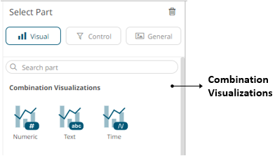
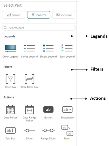
The Select Part pane has three tabs to define the settings of the dashboard visualization or part.
q On the Visual tab  :
:
|
Part |
Description |
|
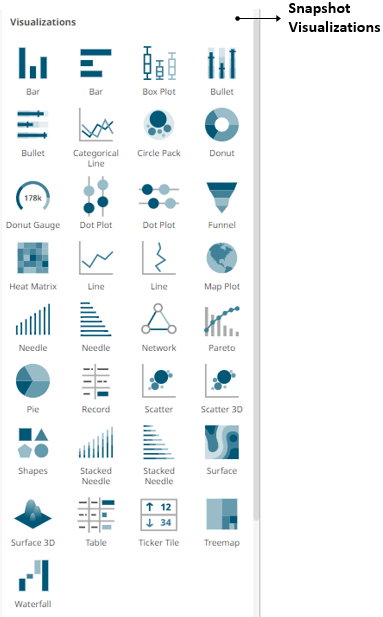
Snapshot Visualizations |
Some of the most common use cases for data visualization software require the system to display information about a data set as it exists at a particular point in time. These snapshot visualizations are extremely useful for understanding relative quantitative and qualitative measures and enable users to gain a comprehensive understanding of complex data sets very quickly. You must populate visualizations with data columns in order for them to function. |
|
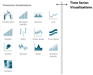
Time series Visualizations |
The ability to handle very large quantities of multivariate time series data is an essential element in a complete visual analysis system. Altair Panopticon offers a range of specialized data visualizations, including Horizon Graphs, Stack Graphs, and Line Graphs, designed specifically to make analyzing historical data easier and more efficient. The software's ability to connect to traditional row-oriented relational databases or column-oriented databases is key to supporting fast, responsive multi-dimensional analysis of large data sets. Our time series capabilities are especially important for users in global investment banks, hedge funds, proprietary trading firms, and exchanges. |
|
NOTE |
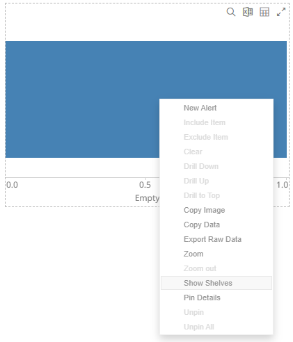
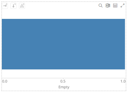
When adding a visualization part, the shelves are turned off by default.
To display the shelves, right-click on the visualization and select Show Shelves on the context menu.
The corresponding shelves of the visualization are displayed (e.g., Columns, Rows, Breakdown).
|
q On the Control
 tab:
tab:
|
Part |
Description |
|
Link legends to visualizations using drag and drop commands. Four types of legend are supported:Series, Color, Icon, and Shape. |
|
|
Filter data in order to highlight outliers, patterns and trends. Filters must be populated with data columns in order for them to function. |
|
|
Allow actions to be executed against pre-defined selections and can be used to provide inputs to filtered data sets. |
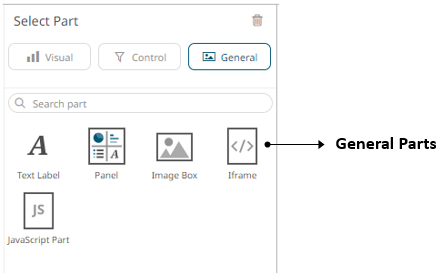
q On the General  tab:
tab:
|
Part |
Description |
|
These can be completely independent of your data. Add labels and explanatory text to help users better understands how to use a dashboard using text boxes. Or link them up to a data column for dynamic displays. |
|
|
Allows resizing of the visualizations in a dashboard. |
|
|
Allows a web page to be displayed within a dashboard or page. |
|
|
These are also independent of your data. Add logos or other graphics to your dashboards using Image Boxes. |
|
|
Allows the designer of a workbook to include a bespoke JavaScript code inside a dashboard. |
Once you have items from the Select Part pane on the dashboard canvas, you can move them around, resize or remove them.