


|
Records Variable Configuration
The Records variable is available in the Record Graph and Table visualizations.
Steps:
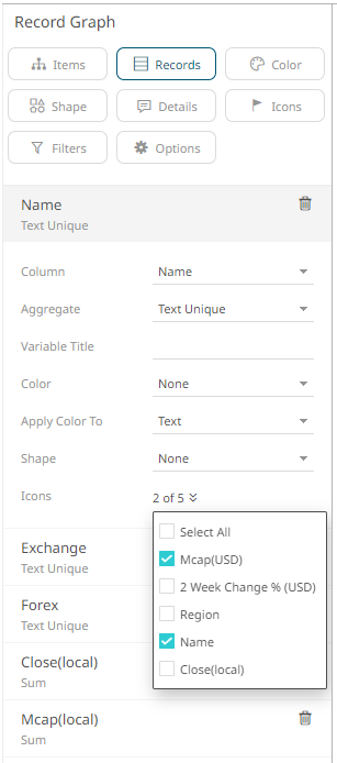
1. To associate columns from the data table, drag and drop them to the Records variable drop area. Select a text column to display the corresponding configuration pane.
The name of the dragged column and its aggregate (e.g., Text Unique) are displayed as the header.
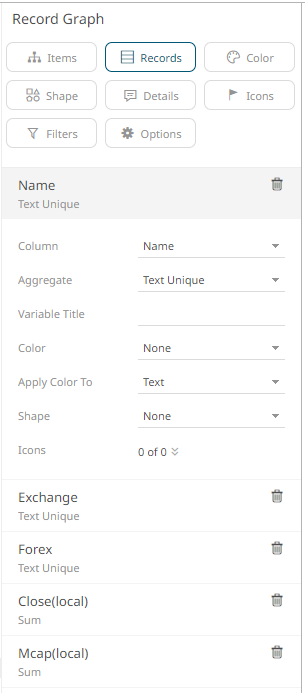
2. You can opt to change the column to the be used as the Record variable from the Column drop-down list.
3. Select the text aggregation method from the Aggregate field: Count Distinct, Text Unique, or Text Concat Distinct.
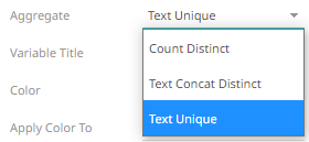
The default is Text Unique.
4. Enter the label of the Record variable in the Variable Title field.
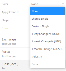
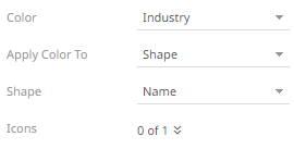
5. Select the column that will be used as the Color in the Apply Color To field.
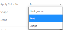
6. Set how the color variable is displayed in the Apply Color To drop-down: Background, Text, or Shape.
Sample 1: If 1 Day Change % (USD) column is selected and the Apply Color To is set to Background, then the visualization will be:

Sample 2: If Industry column is selected and the Apply Color To is set to Text, then the visualization will be:

Sample 3. If Industry column is selected and the Apply Color To is set to Shape, then the visualization will be:
Displaying the shape is a useful visual cue in a record graph. Users will be able to build a legend that will display each unique combination of shape and color, along with the values from the columns used for the shape and color.
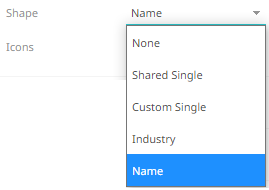
When selecting Shape as the Apply Color To value, ensure to select the Shape value in the drop-down list.


7. Click the Icons drop-down and check the boxes of the columns with icons that will be assigned for this particular column.
8. Click the Save  icon on the toolbar.
When
saved, the  notification
is displayed.
notification
is displayed.
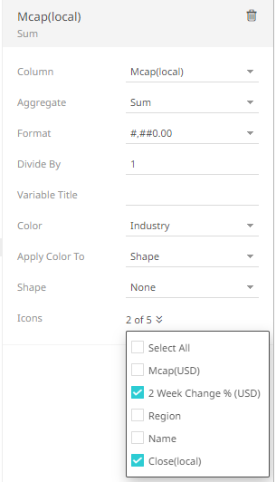
For numeric records, follow the steps below.
Steps:
1. Select a numeric column to display the corresponding configuration pane.
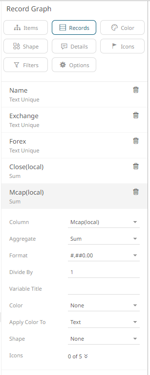
2. You can opt to change the column to the be used as the Records variable from the Column drop-down list.
3. Specify an aggregation method in the Aggregate field.
The default is Sum.
The Records variable also supports a number of other aggregate types.
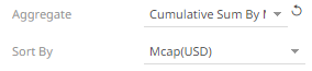
· If you set the aggregation method to Cumulative Sum or Cumulative Sum by Max, the Sort By drop-down list is enabled and displays a list of numeric data columns in the selected data table that can be used as the sorting column for the aggregate.
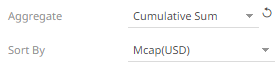
Cumulative Sum By Max is, in practice, Cumulative Sum with a setting to use Max as the sort by aggregation.
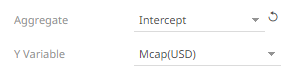
· If you set the aggregation method to Intercept or Slope, the Y Variable drop-down list is enabled and displays a list of numeric data columns in the selected data table that can be used as the Y-axis variable column for the aggregate.
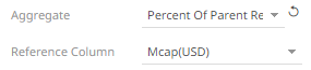
· If you set the aggregation method to Percent of Parent Reference, Percent of Total Reference, or Ratio of Sums, the Reference Column drop-down list is enabled and displays a list of numeric data columns in the selected data table that can be used as the reference column for the aggregate.
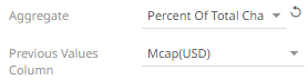
· If you set the aggregation method to Percent of Total Change, the Previous Values Column drop-down list is enabled and displays a list of numeric data columns in the selected data table that can be used as the previous column for the aggregate.
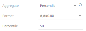
· If you set the aggregation method to Percentile, the Percentile field is displayed. Specify the value that can be used to calculate the value of the selected percentile.
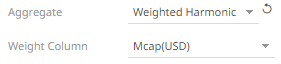
· If you set the aggregation method to Weighted Harmonic Mean, Weighted Mean, Weighted Population Variance, Weighted Stdev, Weighted Stdevp, Weighted Sum, or Weighted Variance, the Weight Column drop-down list is enabled and displays a list of numeric data columns in the selected data table that can be used as the weight column for the aggregate.
4. The Format field lets you specify the format that numbers will be displayed in. Panopticon uses the same formatting rules as Excel.
5. Select the Divide By value to divide a number:
· 1
· 1000 (by a thousand)
· 10000
· 1000000 (by a million)
· 1000000000 (by a billion)
6. Enter the label of the Record variable in the Variable Title field.
7. Select the column that will be used as the Color in the Apply Color To field.
8. Sets how the color variable is displayed in the Apply Color To drop-down: Background or Text.
Sample 1: If 1 Day Change % (USD) column is selected and the Apply Color To is set to Background, then the visualization will be:

Sample 2: If Industry column is selected and the Apply Color To is set to Text, then the visualization will be:

Sample 3. If Industry column is selected and the Apply Color To is set to Shape, then the visualization will be:
Displaying the shape is a useful visual cue in a record graph. Users will be able to build a legend that will display each unique combination of shape and color, along with the values from the columns used for the shape and color.
When selecting Shape as the Apply Color To value, ensure to select the Shape value in the drop-down list.
9. Click the Icons drop-down and check the boxes of the columns with icons that will be assigned for this particular column.
10. Click the Save icon on the toolbar.
When saved, the notification
is displayed.