|
Enable Time Series Analysis
Panopticon supports a number of data visualizations that are useful for monitoring and analyzing time series data, including the Line Graph, Needle Graph, Stack Graph, Horizon Graph, and OHLC/Candle Stick visualizations.
All non-time series visualizations will display a selected time slice (the Snapshot) of a time series dataset, unless displaying time window calculations.
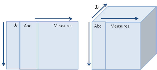
Your source data must be transformed in order to use time series visualization. The transform converts the dataset into a cube, where the Z axis of the cube represents time, providing a set of time slices to play through and calculate across.
When there is a time slice, but not a value determined by the selected dimensions, the value will be set to null, and in the case of a line graph, a gap in the line will be drawn.
The time slices of the output time series can be identical to the input dataset, or as typically the case with sensor data will be standardized by barring (conflating) into an appropriate granularity for display.
A source table to be used for time series must have the following properties:
q A Unique key or set of keys forming a compound key for each data series. For example, you can use the Stock Symbol as the unique ID in a set of Stock Market data.
q A Date/Time stamp of data type Date Time
q A series of numeric or text fields providing values for each unique ID for each available Date/Time stamp
Steps:
1. Click on a data source on the Data Sources pane. The currently selected data source is highlighted (grey background).
The corresponding Data Source Settings pane is displayed.
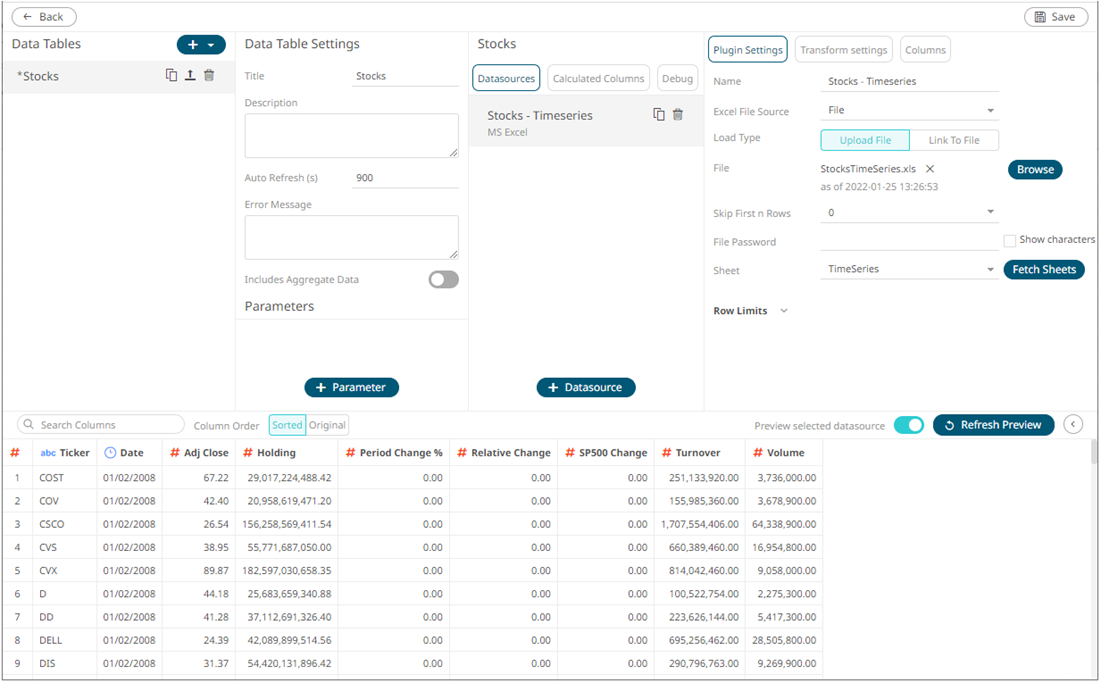
2. Click the Transform Settings button.
The Transform Settings pane displays.
![]()
3. Tap the Transform to enable Time Series analysis slider to turn it on.
|
NOTE |
Once enabled, the Transform Settings button
displays with a check
|
 button
is also enabled.
button
is also enabled.
The check boxes for: one time series per data row, or close and time series with time slices that don’t align, ensure that duplicate values are highlighted, and the time cube volume is minimized.
![]()
4. Click
Fetch Schema  to update columns available
for time series transform.
to update columns available
for time series transform.

5. Select the key or compound key columns from the source list of dimensions to define comparable items over time.

These define each series and correspond to the rows of the generated time cube.
6. Select the column to define the time axis values (Date/Time stamp).
Default value is Date.

7. Set the Date/Time range of the column set in step 5 in the From and To text boxes.
This filters the time series visualization data causing less data to go over the network to the Web client.
|
NOTE |
The range is not calculated from the start and end values but rather from the Max (the start or the first time slice of the dataset) to Min (the end or the last time slice of the dataset) range. For example, the start and end values can be from 2000-01-01 to 2020-01-01 but the conflation still works as it takes the Date/Time range of the supplied time series.
|
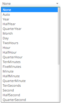
8. Choose whether you want to Conflate the dataset by setting the Barring period to Auto, or a defined value, between Year and Nanosecond.
Setting the barring period conflates the dataset to a defined granularity, returning a set number of data points, by default being between 50 and 1000 for Auto.
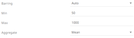
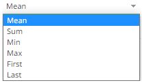
As data is potentially being aggregated across time, an Aggregate must be selected. The default conflation aggregate is Mean. Other options include: Sum, Min, Max, First, and Last.
Barring can be useful to standardize sparse time series which is especially common with sensor data, outputting values at defined time intervals, and potentially minimizing the number of rendered data points.
The available barring periods besides Auto are:
Year, Half Year, Quarter Year, Month, Day, 2 Hours, Hour, Half Hour, Quarter Hour, 10 Minute, 5 Minute, Minute, Half Minute, Quarter minute, 10 Seconds, Second, Half Second, Quarter Second, Tenth Second, Fifty Milliseconds, 10 Milliseconds, 5 Milliseconds, Millisecond, 50 Microseconds, 10 Microseconds, 5 Microseconds, Microsecond, 50 Nanoseconds, 10 Nanoseconds, 5 Nanoseconds, Nanosecond.
However, when the barring period is set to None, you can enable Add Auto Identifier Column: Sequence ID.
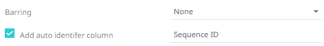
This means that when multiple values are processed at the same time along with selected dimensions, the seqid will be added to each unique occurrence per time slice and defined dimensions, incrementing starting from 1.
9. Choose whether you want to interpolate for missing values.
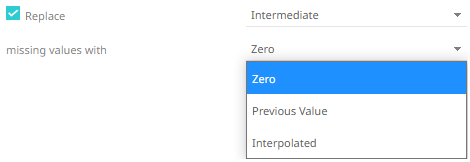
The interpolation can replace missing numeric values with Zero, the Previous Value, or an interpolation between known values (Interpolated).
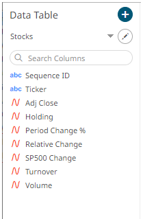
10. Click  .
.
![]()
Click
 then
then
 to save the data table and exit
the Edit Data Table layout. On the Open Workbook in Design
Mode, a time series data table is visually identified by the time
series curve to the left of any numeric time series fields.
to save the data table and exit
the Edit Data Table layout. On the Open Workbook in Design
Mode, a time series data table is visually identified by the time
series curve to the left of any numeric time series fields.