


|
Bar Graph
Bar Graphs are probably the best-known visualization for quantitative data.
You can display Panopticon Designer Bar Graphs either horizontally or vertically. These graphs are available in three variants:
q Standard
q Grouped
q Stacked
In each case, you can sort the layout of the bar graph according to your requirements, and, with hierarchical data, the graph represents the netted position at each aggregated depth level.
You can also use the Bar Graph visualization to display demographic data in so-called Tornado Charts or Population Pyramids.
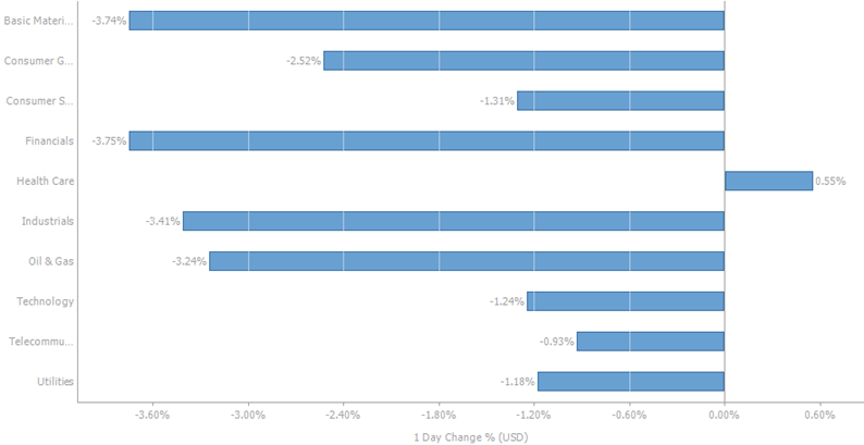
Figure 3-1. A horizontal bar graph.
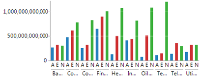
Figure 3-2. A standard bar graph.
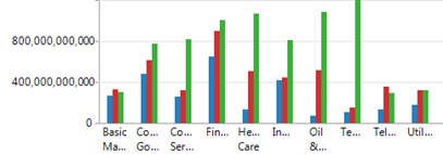
Figure 3-3. A grouped bar graph.
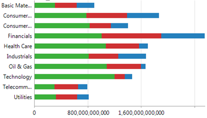
Figure 3-4. A stacked bar graph.
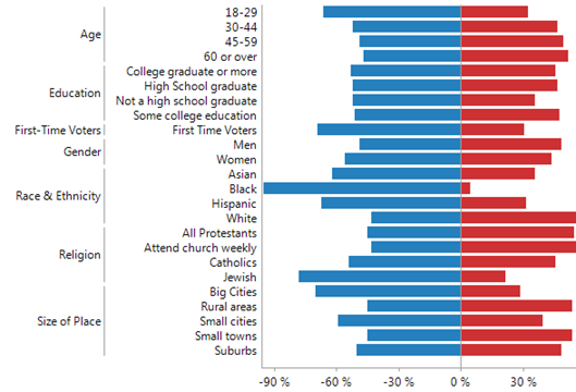
Figure 3-5. A stacked bar graph showing a tornado chart layout.