


|
Donut Gauge Chart
Donut Gauge charts display percentage of total based metrics like Key Performance Indicators (KPI), and support values between 0 and 100%.
They remove unnecessary clutter and instead focus on best displaying the metric and provide an alternative to the Bullet graph.
Panopticon Designer can produce standard Donut Gauge Charts in which the slice angle represents a percentage.
The color variable can represent either a category or another numeric variable.
Donut Gauge Charts can be individual, or displayed in cross tabs, highlighting differences between items.
An alternative visualization to the Donut Gauge to highlight differences between items and contribution to the total may be the Treemap.
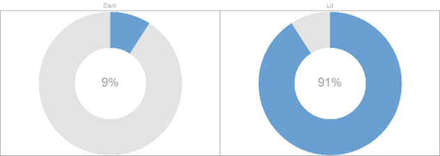
Figure 3-22. Cross Tabbed Donut Gauge (with No Color)
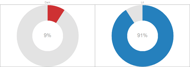
Figure 3-23. Cross Tabbed Donut Gauge (with Categorical Color)
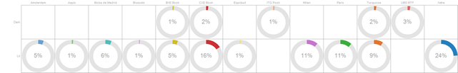
Figure 3-24. Donut Gauge Cross Tabbed into Rows & Columns