


|
Heat Map
A Heat Map is a special type of color-based data visualization that is well suited for analyzing large flat data volumes using an intuitive graphical display. Heat maps are good at representing large numbers of data points in ways that would be unwieldy and hard to interpret using traditional tables or charts.
A Heat Map represents each item in the data set as an equally-sized cell, unlike a Treemap that uses the size of the box to represent a qualitative value and location to represent hierarchical relationships. In a Heat map, the color of the square represents a quantitative value relative to the other boxes in the Heat map, while the location can represent the sorting of another quantitative or categorical value. This allows the analyst to see all of the data items simultaneously. The user can also hover over any item to bring up more detailed information on demand.
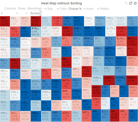
Figure 3-27. A heat map without sorting.
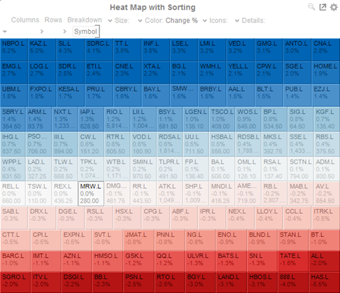
Figure 3-28. A heat map with sorting.