


|
Horizon Graph
Horizon Graphs are a fantastic way to overview a large number of time series in a limited rectangular space. Since this visualization packs the information in a line graph in 1/6th the space through smart pre-attentive color encoding, it allows for an overview of a large number of time series. Users can scan huge amounts of data points across all relevant time series and immediately identify areas of concern that require closer scrutiny.
Our Horizon Graph visualization is particularly useful when you need to see a large number of time series on a single screen. This makes it easy to compare trends and spot patterns that would be very difficult or impossible to see in a standard report.
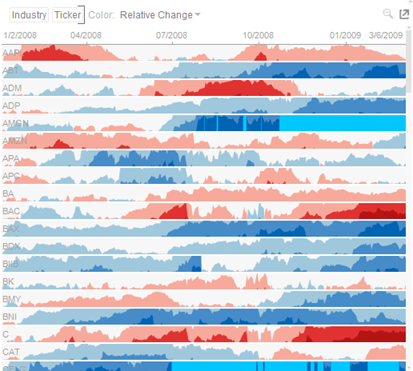
Figure 2-3. A horizon graph.
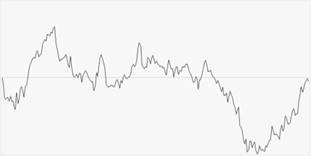
Figure 2-4. Starting with a line graph.
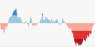
Figure 2-5. Creating color performance bands.
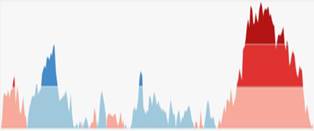
Figure 2-6. Inverting negative regions.
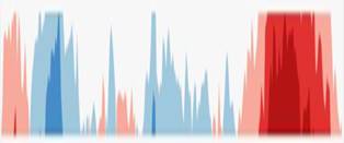
Figure 2-7. Collapsing the performance bands.
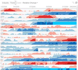
Figure 2-8. A horizon graph is finally created.