


|
OHLC Graph
OHLC Graphs also display time-based distributions of price data. For each time slice, they display:
q Opening Price
q Highest Price
q Lowest Price
q Closing Price
Similar to the Candlestick Graph, a vertical line defines the range of traded prices across the period. However, in this case, the left notch determines the opening price and the right notch determines the closing price.
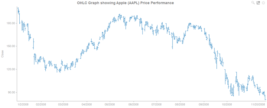
Figure 2-18. An OHLC graph
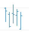
Figure 2-19. Close up of data points in an OHLC graph.