Block Category: Signal Producer
Description: dialogConstant blocks let you easily create custom dialog boxes, commonly called Auto Dialogs, for compound blocks to speed up such tasks as setting, viewing, selecting, and changing user-defined parameter values encapsulated in the compound block.
The Auto Dialog presents all the dialogConstant blocks in the compound block, along with their current values. The changes you make in the Auto Dialog are automatically applied to the specific blocks. This means you no longer must drill into a compound block and change each block parameter.
By displaying only dialogConstant blocks, the Auto Dialog helps ensure that only relevant information is exposed to other users. This greatly reduces the chances of accidental or unnecessary changes to the compound block.

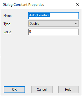
Name: Specifies the label for the data field to be displayed on the block and in the resulting Auto Dialog. When you do not supply a name, dialog constant is used.
Type: Indicates the data type, which controls how the data associated with the block will be displayed in the resulting Auto Dialog. Your choices are:
|
Graphical element type |
Resulting data type |
How the data is displayed in the Auto Dialog |
|
Integer List |
Integer |
Creates a drop-down list box to display meaningful names of elements. To create elements in the list box, enter them in the Value text box, as described below. When you select an element from the list, the output of the block is a 0-based index of the element in the list. |
|
Double |
Double precision floating point |
Creates a static text box in which numeric values can be entered. To create an entry in the text box, enter it in the Value text box, as described below. |
|
Boolean |
Boolean |
Creates a check box that can be turned on or off. To set its initial value, enter it in the Value text box, as described below. The result of the block is the value you enter. |
|
String |
String |
Creates an editable text box in which text can be entered. To create an entry in the text box, enter it in the Value text box, as described below. |
|
Label |
Integer |
None |
|
If the data type is |
To the following |
|
Integer List |
Enter each entry for the drop-down list on a separate line. Entries appear in the drop-down list in the order they are entered in the Value box. The default entry is the first entry. |
|
Double |
Enter a numeric value that will appear in the static text box. |
|
Boolean |
1: puts it in a checked state; 0: puts it in an unchecked state. |
|
String |
Enter a text string |
|
Label |
Nothing |