


|
Dot Plot
Dot Plots have two primary use cases:
q A more effective alternative to a Bar Graph
q A distribution display similar to a Scatter Plot
Dot Plots are an effective alternative to Bar Graphs, particularly in cases where the data being analyzed contains many similar numeric values.
In comparison with the Bar Graph, Dot Plots do not use a zero baseline and are less cluttered. This makes it easier to add additional data variables to the visualization.
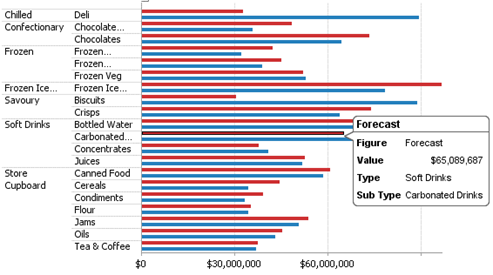
Figure 3-16. A sample horizontal bar graph showing revenues versus forecasts.
Dot Plots can also be used to represent data distributions in which one axis is numeric while the other axis is categorical. Scatter Plots using such data sets can be misinterpreted; Dot Plots of the same data are unambiguous and easy to understand.
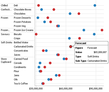
Figure 3-17. A dot plot of revenues versus forecasts
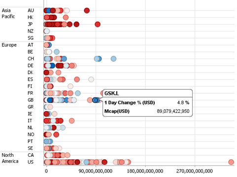
Figure 3-18. A distribution dot plot.