


|
Line Graph
Line Graphs are easy to understand and are a great way to communicate important time-based trends, clustering, and outliers.
They work especially well when comparing ten or fewer data sets (our Horizon Graph is a good solution for displaying time series data with ten or more data sets).
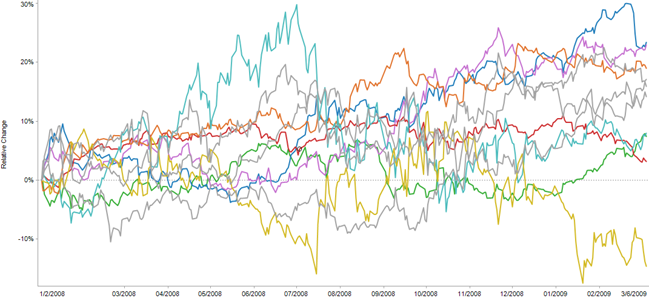
Figure 2-9. A line graph
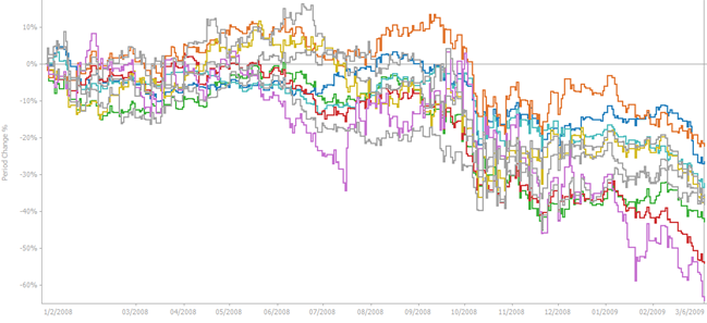
Figure 2-10. A line graph with stepped interpolation
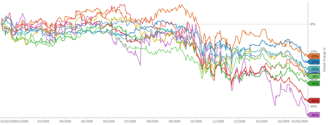
Figure 2-11. A line graph with last values shown on a right aligned Y-axis
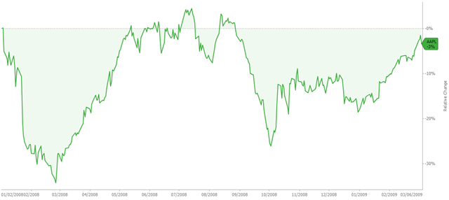
Figure 2-12. A line graph with last value and name shown on a right aligned Y-axis
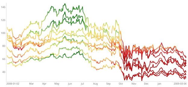
Figure 2-13. A line graph with lines colored by a numeric variable with different color per time slices.
Figure 2-14. A line graph with lines colored by a numeric variable with different color per time slices in a visual table.