Curve Attributes
Customizes the appearance of bar chart curve features, including bar style, line style, color, and weight, symbol style and color, and axis attributes.
Click the Curve Attributes icon, ![]() , on the bar chart toolbar to display the Curve
Attributes panel.
, on the bar chart toolbar to display the Curve
Attributes panel.
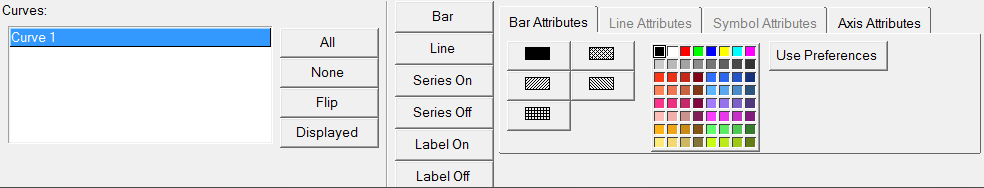
Figure 1. Curve Attributes panel - Bar Attributes tab
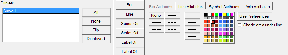
Figure 2. Curve Attributes panel - Line Attributes tab
Curve List
The curve list displays the names of the bar chart curves in the current window.
To change the attributes of a bar chart curve, it must first be select either from the curve list or picked from the window. Attributes can be assigned to more than one bar chart curve at a time by selecting multiple curves from the list or holding down the Ctrl key while picking curves from the window. Attributes are applied only to selected bar chart curves. Selected bar chart curves are highlighted in the list.
Bar/Line
The Bar and Line buttons enable you to view your data as a bar chart or a line curve in the display.
Select Bar to display the y-data value as a bar chart. If you select Bar, only the Bar Attributes and Axis Attributes tabs are displayed.
Select Line to display the y-data value as a line curve. If you select Line, only the Line, Symbol, and Axis Attributes tabs are displayed. When a curve is turned off, the lines and symbols are no longer displayed and the legend does not include curve information.
Series and Labels
- Series On
- Displays the selected curve.
- Series Off
- Removes the selected curve from the display.
- Label On
- Display the legend for the current bar chart.
- Label Off
- Turn off the legend for the current bar chart.
Use Preferences
Line and symbol attributes can be assigned automatically to selected curves using the Use Preferences feature.
Line Attributes
Line styles can be assigned to curves to help differentiate different curves on a plot.
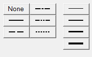
Figure 3.
Click on a line style to apply the style to the currently selected curves.
When None is assigned as a line style, the line is no longer displayed but the symbols assigned to the curve remain visible, creating a scatter plot of the curve. The curve is still displayed in the legend.
In addition to different line styles, line thickness can also be assigned to a curve. The line weight for each curve is displayed in the legend. Click on a line weight to change the thickness of the currently selected curves.
Any of the 64 colors can be assigned to a curve. Select a color from the color palette to change the color of the selected curves.
Symbol Attributes
Symbols can be placed on a curve to indicate data points.
There are nine different symbols available. To mark the data points on the currently selected curves, select a symbol from the symbol palette.
The frequency of the symbol placement is determined by the Every field. By default, Every is set to 1 so symbols are placed at every data point. To change the symbol frequency, enter a number in the Every field. For example, if Every is set to 5, a symbol is placed at every fifth data point on the curve.
Any of the 64 colors can be assigned to a symbol. Select a color from the Symbol Attributes color palette to change the color of the symbols on the selected curves.
Scatter plots can be created by setting the line style of a curve to None and then assigning a symbol to the curve.
Bar Chart Styles
Styles can be assigned to bar charts to help distinguish them in an HyperGraph 2D window.
From the , click a bar chart style to apply it to the currently selected bar chart curve. You can apply a solid color to a bar or you can apply 1 of 4 line patterns to a bar. To change either the solid color or the line pattern color, select any of the 64 colors from the color palette. The style selected for each bar chart is displayed in the legend.
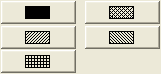
Figure 4.
Axis Attributes
From the , pick the value axis for the bar chart.
From the drop-down menu, select the primary axis or a secondary axis that was added using the Axes panel.