HG3D-1000: Define Waterfall Plots
In this tutorial, you will learn how to create waterfall plots.
The Waterfall panel can be accessed one of the following ways:
- From the toolbar, click the Waterfall panel icon,

- From the menu bar, select
The Waterfall panel allows you to create waterfall plots from XY force response data and input pulses. If a waterfall plot exists in the current window, HyperGraph 3D automatically fills in the default values.
Open Session File trimmer.mvw and Create HyperGraph 3D Window
- From the menu bar, select .
- From the 3dplotting folder, select the file trimmer.mvw and click Open.
- Click Close on the message log that appears.
-
Click the Add Page icon,
 , to add a
page.
, to add a
page.
- Select HyperGraph 3D from the Select Application Menu icon.
Create a Frequency versus Time Waterfall Plot
-
Click the Waterfall icon,
 , on the toolbar to enter the panel.
-
Click the curve selection icon
 in the Response Field for Data Curves:.
-
Choose the Force vs Time - Raw curve.
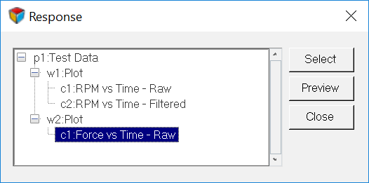 Figure 1.
 -
Click Preview to view the curve.
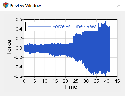 Figure 2.
 -
Click Apply.
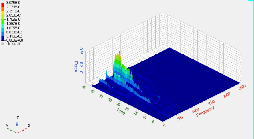 Figure 3.
Create a Frequency versus RPM Waterfall Plot
While in the Waterfall panel, do the following:
-
Under Data Curves, select RPM vs Time – Raw for
Response.
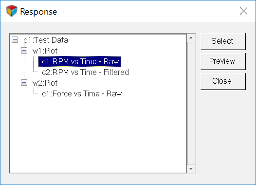 Figure 4.
 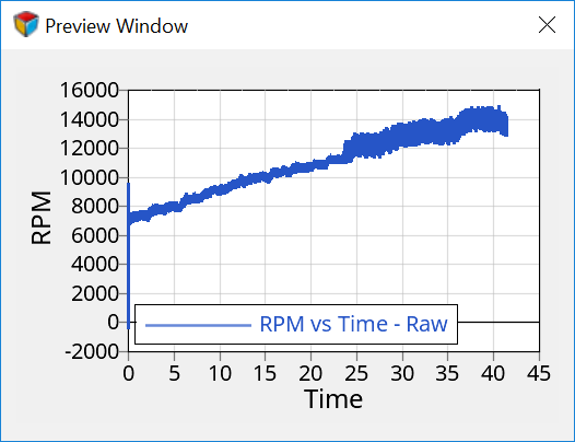 Figure 5.
 -
Select RPM vs Time – Filtered for Input under Data
Curves.
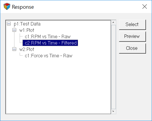 Figure 6.
 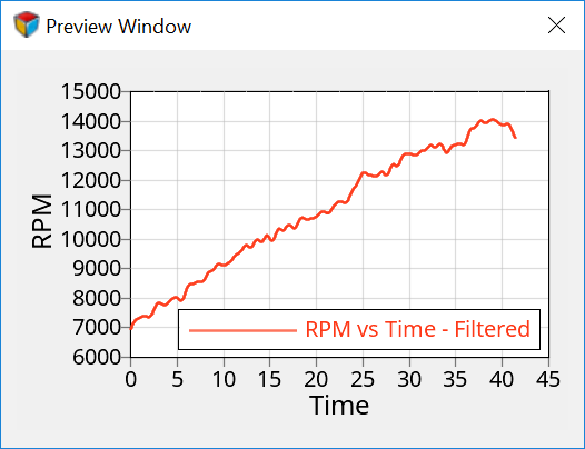 Figure 7.
 -
Click Apply.
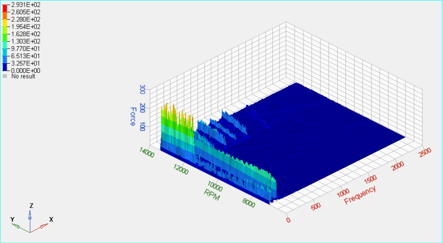 Figure 8.
Create an Order Waterfall Plot
While in the Waterfall panel, do the following:
-
Click Apply to create the plot.
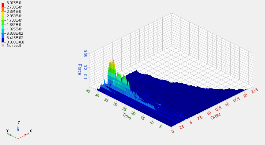 Figure 9.