HG-3000: Working with Bar Charts
In this tutorial, you will learn how to create bar charts by entering values, importing a data file, or specifying a mathematical expression.
When the plot type is set to Bar Charts ( ), the Define Curves panel allows you to add and edit bar
charts in the active plot window. It can be accessed one of the following ways.
), the Define Curves panel allows you to add and edit bar
charts in the active plot window. It can be accessed one of the following ways.
- Click on the Define Curves panel icon,
 , on the toolbar
 - From the menu bar select Curves > Define Curves
Bar charts are comprised of data and categories. Data can be entered as values, read from an external file, or defined as a mathematical expression.
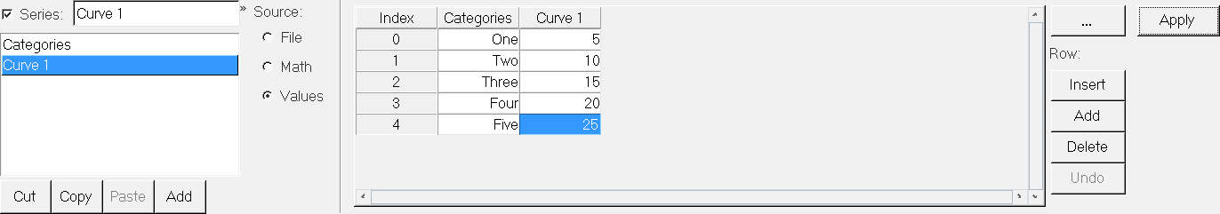
Figure 1.
Create a Bar Chart by Entering Values in the Define Curves Panel
Enter the values 563.35, 567.22, and 423.51.
-
From the plot type menu, select Bar Chart,
 .
.
-
Enter the Define Curves panel,
 .
.
Create a Bar Chart by Importing Values from the Data File
- Add a second bar chart to the current plot window.
- Rename Curve 2 to Nodal Point 2.
- Under Source, select File.
- Click the file browser next to File: and open the nodal_values.dat file, located in the plotting folder.
- Leave Type: set to Unknown.
- Leave Request: set to Block1.
- Leave Component: set to Column1.
- Click Apply to create the bar chart.
Create a Bar Chart Using a Math Expression
-
Click Apply to create the bar chart.
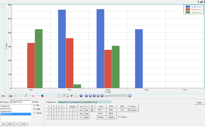 Figure 2.