Browser
The Browser allows you to view the assembly (with components under it) and set entities in the model structure, while providing limited display and editing control of those entities.
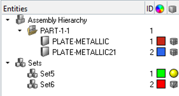
Figure 1. HyperView Player Browser
The Browser is turned on and displayed on the left side of the window by default; however, it can be turned off using the right-click context menu in the graphics area (a check mark indicates the Browser is activated for display). In addition, the width of the entire Browser can be resized by clicking on the line that separates the browser from the graphics area (note the double arrow) and dragging and releasing the mouse button once the desired width is reached.
Multiple entities of the same type are collected into folders in the tree structure. Each folder can be expanded or collapsed to display or hide its contents. Assemblies can also have sub-folders within the main Assembly folder, so that the items related to each assembly appear within that assembly’s folder in the Assembly Hierarchy.
You can sort the entities in a folder by clicking on the heading of each column. Click the Entities heading to sort alphabetically by name, or click the ID heading to sort numerically by entity ID, and so on. Repeated clicks on the column heading will toggle between ascending and descending order.
The Browser tools include a context menu and display controls built into the tree:
Context Menu
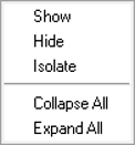
Figure 2.
| Option | Description |
|---|---|
| Show | Displays the selected item(s) in the graphics area. This selection affects
each item’s local display control. You can also use this on the entire folder. In such cases, this shows all of the items within that folder. |
| Hide | Turns off the selected item(s) in the graphics area. You can also use this on the entire folder. In such cases, this hides all of the items within that folder. |
| Isolate | Isolate displays only the selected entities, turning their display state to on, and turning off the remaining entities. |
| Collapse All | Collapses all items in the tree structure so that only the top-most level of items displays. If you have a particular entity or folder selected in the browser and select Collapse All, then this option only collapses the items beneath the currently selected entity or folder. |
| Expand All | Expands all items in the tree structure, exposing every item nested at every level. If you have a particular entity or folder selected in the browser and select Expand All, then this option only expands the items beneath the currently selected entity or folder. |
Display Controls
| Display Control | Description | |
|---|---|---|
| Entity Display Icons | Entities are displayed or hidden by toggling
the corresponding icons (located next to each line item in the tree view). The
following rule applies:
|
|
| Colors | Components (parts) and Entity Sets can all be colored individually. The currently assigned color displays in the column, however it is not able to be changed. | |
| Display Mode | Components (parts) and Sets have several
display states. You can select these display modes by clicking the small icons in
the column for each component or set. A pop-up menu is displayed from which you
can choose the new style. Depending on which option you select, the entity displays differently: |
|
| Components |
|
|
| Sets |
|
|

