After loading a file, select a method to display the energy contribution
data.
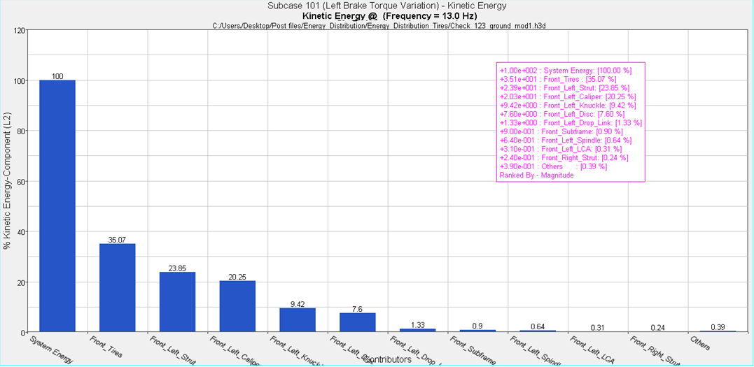
Bar
Allows you to plot energy distribution on a bar chart.
First, enter a specific frequency in the Specific frequency field, or
use the slider bar to select a frequency value. When you use the slider
bar to select a frequency, a red line is displayed on the response plot
and is dragged simultaneously as you drag the slider bar. The default
scale is percentage (%), meaning all energy contributors are scaled by
the total system energy, and plotted in percentages of it.
Comparator Level
Subsystem (L1) – Energy distribution is combined to the
subsystem (modules next to the root or all connections in
the assembly) level. See the Comparator Group Level table
for more information.
Component (L2) – Energy distribution is combined to the
component (module or connections owned by a module)
level.
Contributor (L3) – Energy distribution is presented at the
contributor (sum of FE components or individual connection)
level.
Element (L4) – Energy distribution is presented at the
individual FE element level (only available for Contour
plots).
System Modes – Energy distribution is presented at the
individual system modes level.
Show highest contrib.
Select the number of the highest contributors to
display.
Available numbers are 1 though 20 in increments of 1, and
All.
Optionally, you can filter energy contributors to a smaller
set by selecting the Filter Contrib. dialog icon, .
Rank by
Magnitude - Contributors are ranked by their magnitude.
Magnitude AVG - Contributors are ranked by the average
magnitude value over the frequency range.
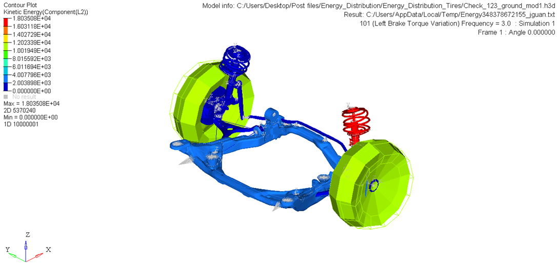
Contour
Creates a contour plot of the energy distribution at a specific
frequency.
Enter a frequency in the Specific frequency field, or use the slider bar
to select a frequency value. When you use the slider bar to select a
frequency, a red line is displayed on the response plot and is dragged
simultaneously as you drag the slider bar.
All other options are similar to those for the Bar plot, except for the
check box that turns on the exploded view. The default scale is
linear.
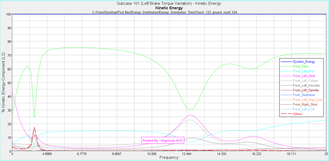
2D Line
Creates a plot of energy distribution on a 2D line plot (overlay).
Frequency range indicates the available range, based on the frequencies
used during the Energy Distribution Analysis.
Using the From and To fields, you can customize your own frequency
band.
All other options are similar to those for the Bar plot. The default
scale is percentage (%), meaning all energy contributors are scaled by
the total system energy, and plotted in percentages of it.
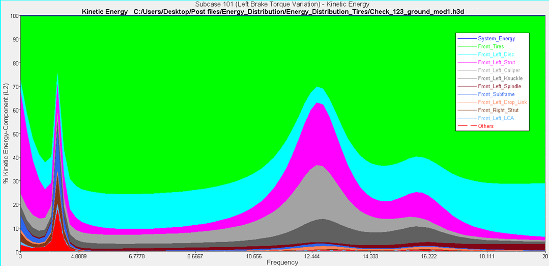
Sand Dune
Creates a plot of energy distribution on a Sand Dune plot, in which each
the energy contributor is added on top of others, giving each
contributor a unique color band.
Frequency range indicates the available range, based on the frequencies
used during the Energy Distribution Analysis.
Using the From and To fields, you can customize your own frequency
band.
All other options are similar to those for the Bar plot. The default
scale is percentage (%), meaning all energy contributors are scaled by
the total system energy, and plotted in percentages of it.
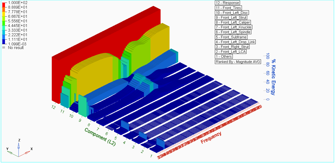
3D Bar
Creates a plot of energy distribution on a 3D Bar plot.
Frequency range indicates the available range, based on the frequencies
used during the Energy Distribution Analysis.
Using the From and To fields, you can customize your own frequency
band.
All other options are similar to those for the Bar plot. The default
scale is percentage (%), meaning all energy contributors are scaled by
the total system energy, and plotted in percentages of it.
Display Options
Customize the plot, including scale, weighting, and the plot
layout.
 .
.