Distribution Post Processing
Analyze distributions of run data.
Analyze Distributions of Run Data
Analyze all the distributions of run data in a histogram or box plot from the Scatter post processing tab.
- From the Post Processing step, click the Distribution tab.
- From the Channel selector, select the channels to plot.
-
Switch the view between histogram and box plot by clicking
 or
or  , located above the
Channel selector.
, located above the
Channel selector.
Distribution Tab Settings
Settings to configure the plots displayed in the Distribution post processing tab.
- Histogram
- Turn the display of histogram bins on and off.
- Probability density (PDF)
- Turn the display of PDF curves on and off.
- Cumulative distribution (CDF)
- Turn the display of CDF curves on and off.
- Bins
- Change the number of bins that displays.
About Box Plots
A box plot sorts data and draws a box from the lower quartile (1st quartile, Q1, 25%) to the upper quartile (3rd quartile, Q3, 75%).
Quartiles of a sorted data set consist of the three points (Q1, Q2 which is also the median, and Q3) that divide the data set into four groups, each group comprising a quarter of the data. The median and mean of the data are also marked in the box. In HyperStudy, this box is painted dark green.
- Lower whisker
- Q1 – 1.5*IQR
- Upper whisker
- Q3 + 1.5*IQ
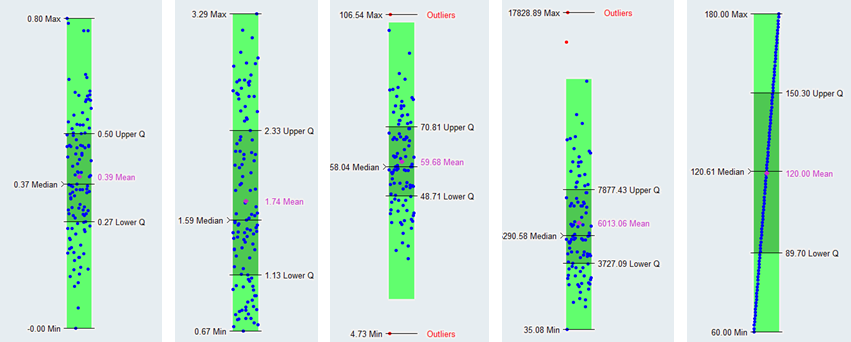
Figure 1.
Box plots display the distribution of data. Use box plots to find the range, mean, median, quartiles, whiskers and outliers. This information tells you the spread and skewness of the data and helps you identify outliers. It is important that you understand the spread and skewness in order to understand and improve the variations in the data. Identifying the outliers gives you an opportunity to investigate these data points and resolve possible issues that you may have missed.
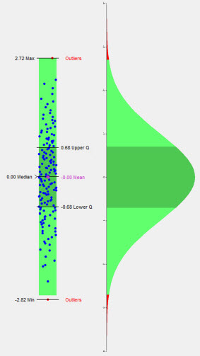
Figure 2.
About Histograms
A histogram displays the frequency of runs yielding a sub-range of output response values.
The size of the sub-range is defined as the total range of the output response value, divided by the number of bins. Histograms are displayed by blue bins.
PDF (Probability Density Function) curves illustrate the probability of the output response being equal to a particular value. PDF is displayed as a red curve.
CDF (Cumulative Density Function) curves illustrate the probability of the output response being less than or equal to a particular value. CDF is displayed as a green curve.
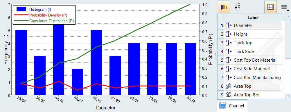
Figure 3.