Create GUI with OML Commands
Create a graphical user interface with OML commands and functions.
The software installation includes OML commands and functions with which you can create graphical user interfaces and, with the appropriate input entries, graphical widgets, such as pushbuttons, sliders, and drop-down menus.
Typically, combinations of the following functions are used to create a GUI:
uipaneluicontroluibuttongroupuitableuigetdir, uiputfile, uigetfileuiresume, uiwait
Try executing the following code to produce a figure with an edit box.
figure_handle = figure();
set(figure_handle,'Name','GUI Demo','Position',[100 50 500 250]);
uicontrol(figure_handle,'Style','edit','Position',[50 50 300 25]);
Notice that the uicontrol function is used with arguments to
generate the demonstrated edit box. Similarly, you can use other GUI functions and
arguments to create a wide range of widgets.
Overview of uicontrol Function
The uicontrol function takes multiple input arguments for creating
graphical widgets with different functions, styles, shapes and sizes. By changing
the input arguments of uicontrol, you can create different control
objects.
The following table provides details of the type of widgets, namely style properties,
that you can create with the uicontrol command by applying the
'style' argument followed by a style property. For example,
uicontrol('style','pushbutton') or
uicontrol('style','edit') and
so on.
| Style Property | Example | Description |
|---|---|---|
| pushbutton | 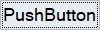 |
Performs a user-defined operation when pressed. |
| togglebutton |  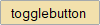 |
Appears like a push button, but serves to visually indicate the state of pressed or not pressed. |
| checkbox |  |
Provides a selection of one or many check boxes within a button group. |
| radiobutton | 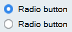 |
Provides a group of radio buttons from which you can select one button. |
| edit |  |
Creates a space to enter textual information. |
| text |  |
Displays a predefined text passed as an
argument to uicontrol . |
| slider | 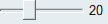 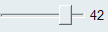 |
Provides a slider that you drag to select a value between a given range. |
| listbox |  |
Displays a defined list of items from which you can select one or more items. |
| popupmenu | 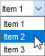 |
Expands a pop-up menu with a list of options from which you can select. |
uicontrol object. All valid attributes are described in the
following table:
| Style Property | Argument | Description |
|---|---|---|
| units |
pixels normalized |
Units are the measurement units that describe the position and dimensions of a graphical object. 'Pixel' units take values between 0 to 1000 and 'normalized' units take values between 0 and 1. |
| position | [0.6 0.16 0.4 0.4] 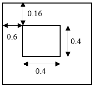 |
Specifies the position and size of the control object in the vector of the form [left top width height]. For example, the values [0.6 0.16 0.4 0.4] in normalized units indicate that 0.6 is the distance from the left where the object starts; 0.16 is the distance from top where the object starts; 0.4 is the width of the object; and 0.4 is the height of the object. |
| value |
1 -1 0 (integer or double) |
Specifies the current value of a style property. For example, 1 and 0 for check box or radio buttons if they are selected or not selected, respectively. If the 5th entry of a list box is selected, then the value is '5'. |
| enable | on or off | Specifies if a property of the control object is enabled. |
| visible | on or off | Specifies the visibility of the control object. |
| callback | @callback_function_defined(^this function must take two arguments) |
Defines the function that is to be executed via click or widget action. |
| string |
Any text as a string or a cell or
|
Specifies the text that is displayed in the GUI. |
| fontangle |
regular italic |
Specifies the angle of the displayed font. Default angle is ‘regular’. |
| fontname |
MS Shell Dlg centuar … |
Specifies the name of the displayed font. Default name is ‘MS Shell Dlg’. |
| fontsize | Font size number | Specifies the size of the displayed font. Default size is 8. |
| fontweight |
normal bold |
Specifies the weight of the displayed font. Default weight is 'normal'. |
Using the uicontrol Function
You can create and invoke a widget as follows:
- Create a figure handle with assigned positions.
- Add a uipanel to the figure and assign space for a plot.
- Create the required uicontrol objects in the uipanel.
- Assign respective attributes to each control object.
- Define and assign a callback function for each control object.
Review the following code and observe the position and dimensions of the figure object created. Note that position is defined using normalised units.
f = figure('units','normalized','position',[0.2 0.3 0.6 0.7]);
 undock(f);
Now, change the position to [0 0 0.4 0.4], and run the code again.
The figure shifts its position and dimension according to the new position
arguments.

Assigning Axes to GUIs
To create an axes object that generates a plot within a GUI, define an axes handle as follows. Run the example code, and notice that some space is created for a plot.
f = figure();
ax = axes(f,'units','normalized','position',[0.1 0.1 0.5 0.5]);
You can later refer to the axes handle in order to generate the desired plot style with the required data.
Working with Callback Functions
A callback function is a function that is triggered when a defined action is
performed on a specified GUI element. A callback function is passed as an argument
of uicontrol, which is then invoked to complete a user-defined
routine or action.
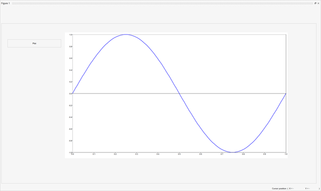
The following example walks you through the steps to create a
pushbutton that plots a sine curve when pressed.
- Assign a
uicontrolfunction to a new variable that is thebutton_handle. - Define the handle of the
uipanelas the parent object’s handle. - Determine the
unitsused asnormalized. - Assign the position as
[0.02 0.05 0.2 0.05]in normalized units. - Define the style of the control object as
pushbutton. - Define the name of the
pushbuttonwith the help of the string option asPlot. - Assign the callback function as
@plot_curve. - Define the callback function that plots a sine curve and takes two arguments.
clear all; close all; clc;
global panel1;
function plot_function(handles,callback)
     global slider_handle;
     freq_value = 1;
     t = [0:1/128:1];
     x = sin(2*pi*freq_value*t);
     plot(t,x);
end
f = figure('units','normalized','position',[0 0 0.9 0.9]);
panel1 = uipanel(f,'units','normalized','position',[0 0.1 0.99 0.89]);
axes('units', 'normalized', 'position', [0.2 0.15 0.7 0.7]);
button_handle = uicontrol(panel1,'style','pushbutton','units','normalized', ...
            'position',[0.02 0.1 0.17 0.05],'string','Plot',...
            'callback',@plot_function);
The code example produces a GUI that displays the following sin curve when the
Plot button is clicked: