Axis attributes, such as labels, color, and scaling, can also be modified using the
Axes panel.
To display the panel, click the Axes button, , or click on an axis label in the HyperGraph window. You can also access the panel from the
Annotations menu or toolbar.
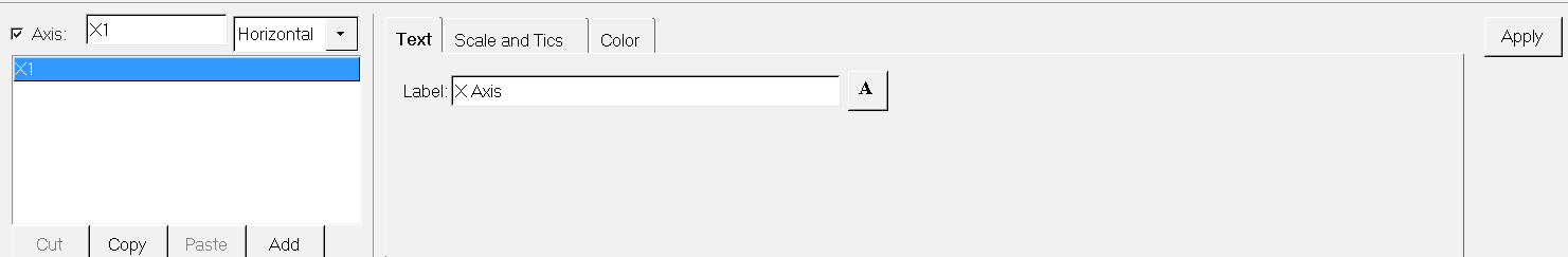
Figure 1. Axes Panel - XY Plot
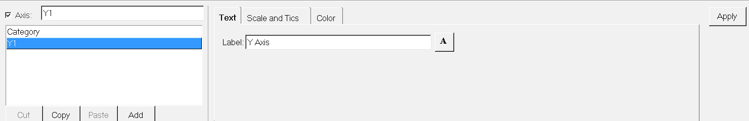
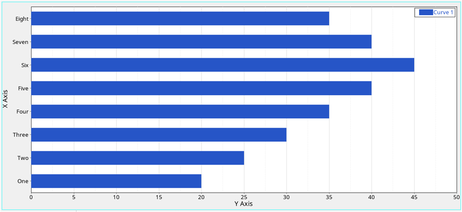
Figure 2. Axes Panel - Bar Chart
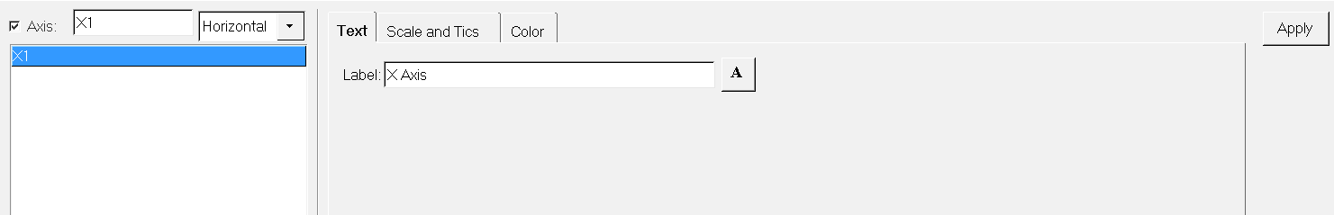
Figure 3. Axes Panel - Complex Plot
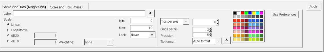
Figure 4. Axes Panel - Polar Plot - Magnitude
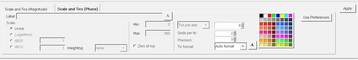
Figure 5. Axes Panel - Polar Plot - Phase
The options available on the Axes panel depend on the current plot type:
XY Plot, Bar Chart, Complex Plot, or Polar Plot.
Axis List
XY Plot
Every XY plot has a primary horizontal axis and a primary vertical axis.
The primary axis is the default axis. From the Axis
list, use the Axis option menu to add up to 32 horizontal and 32
vertical axes. Axes can be added, cut, copied, and pasted using the buttons
displayed below the list of axes' names. Axes can also be
copied and pasted between windows.
Bar Chart
Every bar chart has a primary (vertical) axis and a category
(horizontal) axis. The primary axis is the default axis. Like XY plots, from the Axis list, use the Axis option menu to add up to five
additional (six total) vertical axes. The primary axes and any
additional vertical axes can be added, cut, copied, and pasted using the
buttons displayed below the Axis list. Axes can also be copied
and pasted between windows.
From the 2D View Controls toolbar, click
Flip XY, , to create horizontal category
labels when the axes are flipped.
Figure 6.
Note: The category axis label can be renamed, however it cannot be
added, deleted, copied, or pasted. Use the Define Curves panel to change
the category name.
Complex Plot
Every complex plot has one primary horizontal axis and one primary
vertical axis. Complex plot axes can be renamed, but they cannot be
copied, pasted, deleted, turned off, or moved.
Note: Primary axes can be
copied, pasted, and renamed, but they cannot be deleted or
moved.
Attributes
Axis Attributes
An individual axis can be turned on and off. When an axis is turned off,
the curves associated with the axis are also turned off. To turn off an
axis, select it from the axis list and deselect the
Axis check box.
Label
The axis label is a single line of text displayed alongside the axis in
the HyperGraph window. It is automatically
updated in HyperGraph when you enter a new
name on the tab.
For bar charts, labels can be placed over both stacked and clustered
bars.
For polar plots, the axis label is automatically updated when you enter
a new name in the Label field.
For the r axis, the label is displayed along and under the "0" line
between the center and the right side of the circle.
For the theta axis, the label is displayed below and outside the
circle.
Note: Import templates can be written that specify the text
for axis labels. This enables axis labels to be automatically
included when plots are constructed using the Reports
panel.
Any of the 64 colors can be assigned to the axes. After
selecting an axis, select a color from the
palette to instantly change the color of the axes.
For Polar Plots, select the r axis or theta axis tab and select a color
from the palette to instantly change the axis color
Click Use Preferences to set the
axes to the default color specified in the
preferences.mvw file.
Note: See Preference Files for more information on specifying
defaults in the preferences.mvw
file.
Multiple Axes
Multiple axes allow you to easily view curves of different scales on the
same plot by assigning the data vectors to separate,
appropriately-scaled axes. Data vectors are assigned to
axes using the Scales, Offsets, and Axis Assignments
panel for XY Plot.
For Bar charts, they are assigned using the Curve Attributes panel > Axis Attributes tab.
Note: Complex plots and polar plots do not support multiple axes.
On the Axes panel, the curve name is defined by a Templex expression instead of a fixed string. The Templex expression is visible in the editable fields only. In
non-editable fields, the evaluated expression is displayed. In most cases, the
evaluated expression should match the text that was hard-coded in previous versions.
Axes can be represented by a linear scale, a logarithmic scale, a dB10 scale, or a
dB20 scale.
Each axis can be represented by a different scale. Use the radio buttons to select
the appropriate scale for each axis. For bar charts, the category (horizontal) axis
cannot be represented in this way. Refer to the following table to view the scale
types available for complex plots:
Axis Type
Scale Type Options
X Axis
Linear
Logarithmic
Y Axis
Phase
Linear
Magnitude
Linear, logarithmic, dB10, dB20
Real
Linear, logarithmic, dB10, dB20
Imaginary
Linear, logarithmic, dB10, dB20
r axis
The circular axis lines are spaced to match the chosen setting.
When you change the Min and Max, HyperGraph
updates the circular grid line values to match the new maximum and
minimum. The minimum value may be negative for radar plots.
theta axis
Linear scale is the only option.
For the theta axis, HyperGraph evenly
distributes the range of values around the circle, theta = 0 to theta =
360. HyperGraph does not display the maximum
value because it would overlap the minimum value. For radar curves,
HyperGraph connects the last value to
the first value.
When a curve is constructed, the minimum and maximum axis values are set so that the
curve fits in the window by default. When you select a different axis scale type,
the minimum and maximum values automatically change. New minimum and maximum values
can be specified in the Min and Max fields. Altering the minimum and maximum values
for an axis scales the plot along that axis.
From the 2D View Controls toolbar,
click Fit All, , to return Min and Max to the default
values and scale the curve to fill the window. Press Enter or click Apply to accept the
changes. From the Lock drop-down menu, select Always
to restore the current axes values when Fit is selected from the 2D View Controls.
dB10 axis scale type
Curve data is scaled using the formula Data = 10.0 *
log10(Original_Data). If no curves exist on the
graph, the minimum value will default to -30 and the maximum to 10.
dB20 axis scale type
Curve data is scaled using the formula Data = 20.0 *
log10(Original_Data). If no curves exist on the
graph, the minimum value will default to -60 and the maximum to 20.
Lock
Choose from Never, At Import, or
Always.
Never
The selected axis is automatically scaled to fit new curves or bar
charts that are added to the axis.
At Import
The selected axis remains scaled to fit the curve(s) currently assigned
to it and it is not scaled to fit new curves.
Always
The axes are not fit with any of the operations and will always be
locked.
For Bar Chart, if Lock is set Never,
the axis is not scaled to fit new bar charts. When the category axis is selected from the Axis list and Lock is set to
Never, you can select the categories that you want to
display in the HyperGraph window. Select the start and end categories and click Apply. Those categories are
displayed in the HyperGraph window.
Horizontal labeling rotates the category text to horizontal when the X and Y-axes are
flipped (X becomes the vertical axes). To flip the X and Y axes, click the Flip
XY icon on the 2D View Controls toolbar.
Bar chart labels can be slanted diagonally to prevent long names from
overlapping.
Axis Tics
Use the Scales and Tics tab to display axis values using one of three
formats: auto, scientific, or fixed.
Auto Format
Determines the best format for displaying axis values and truncates
trailing zeros.
Scientific
Expresses values in exponential form.
Fixed Format
Expresses values using a specified number of decimal places.
Note: For bar charts, the category (horizontal) axis cannot be displayed using the above
formats.
The number of tics on each axis (or tics per decade if the axis is logarithmic,
decibels, or dB10) is controlled by either entering a specific number or an
increment.
Enter a value in each text field or use the buttons to change the current values
incrementally.
Tics per axis
Select Tics per axis to add a specific number of
tics.
Tic Increment
Select Tic Increment to add tics at specific
intervals.
Grids per Tic
If using the linear axis, use Grids per Tic (or grids per decade if the
axis is logarithmic, decibels, or dB10) to change the number of grid
lines on the graph.
Click Apply to accept the settings.
Both fixed decimal format and scientific notation display numbers to the right of the
decimal point. The accuracy of each format can be adjusted by entering a value in
the Precision text field.
Attention: For Auto format, a
built-in "best look" algorithm is used to present the values. In this algorithm,
in many cases, the set precision may not be honored.
Precision specifies the number of digits displayed to the right of the decimal
point.