Plots View
The Plots view,  , displays all plot entities displayed in the current
page/window.
, displays all plot entities displayed in the current
page/window.
The tree contains plot entities grouped within their page and window. For example, a folder for each page is displayed and can be expanded to view all plots on the page. When each window folder is expanded (for example, w1:XY Plot in the image below), all entities for that window are visible (curves, datum lines, headers/footers/legend, titles, and so on). You can select multiple entities of the same type at the same time, but you cannot select multiple entities of different types.
You can select a plot window attribute under the window heading (for example, Legend or X1 in the image below) to highlight the entity in the graphical area. The properties for that entity are displayed in the Entity Editor, located in the lower portion of the plot browser.
If you select Legend, for example, the legend is highlighted and surrounded by a yellow border and the legend's properties are displayed in the Entity Editor.
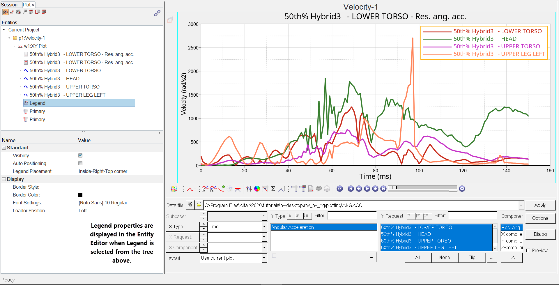
Figure 1. A sample browser tree with the Plots view selected is shown below:
Likewise, clicking on a curve or vector displays its properties in the Entity Editor. Vectors are shown in the tree under their corresponding curves. To apply a filter to an x or y vector property, right-click on the x or y vector’s property in the Entity Editor and select Add as filter. After a value is given to that filter, all vectors with that value for that property are shown in the Plot Browser, with their corresponding curves. See Plot Browser Filters for more information.
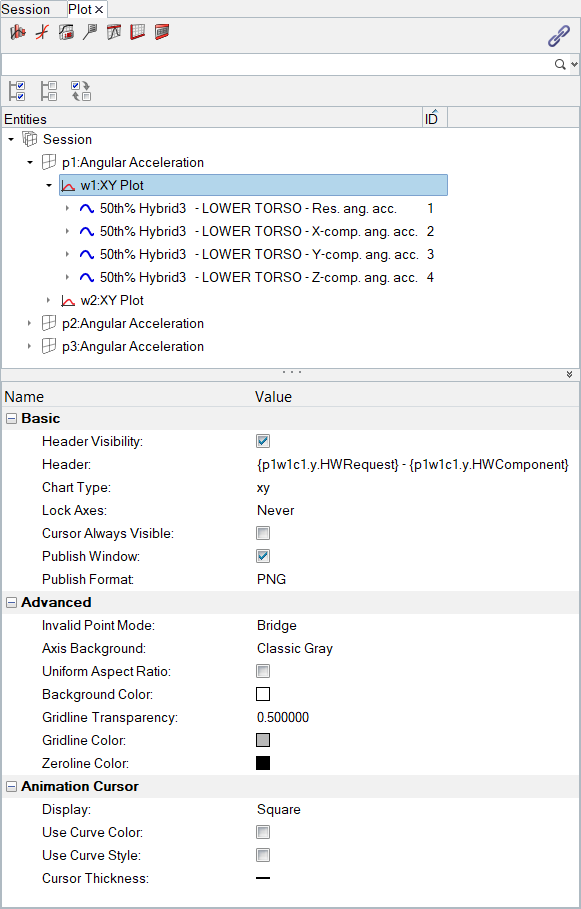
Figure 2. A sample browser tree with the Plots view selected
The following properties are visible and editable in the Entity Editor when Plot view is selected:
Basic
- Header Visibility
- Displays the unevaluated (Templex) expression for the plot's header.
- Header
- Check the box to display the header on the page.
- Chart Type
- Displays the current plot's chart type. Click on the icon to select a different chart type. Options include XY Plot, Bar Plot, Complex Plot and Polar Plot.
- Lock Axes
- Choose from Never, At Import, or Always.
- Cursor Always Visible
- Select this option to always display the plot’s cursor, even if you click on another window on the page. This is helpful when you are synchronizing animation, plot, and video windows. The cursor(s) allows you to see the current animation time step on the plot, even when the plot window is not active.
-
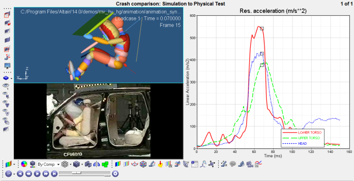
Figure 3. - Publish Window
- Select Publish Window to publish the current window contents.
- Publish Format
- If Publish Window is selected, select a format type from the drop-down menu.
Advanced
- Invalid Point Mode
- If a CSV file contains blank spaces, select Bridge or Gap.
- Axis Background
- Axis Background set to Classic Gray displays the gray color in the axes background. This is the default.
-
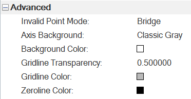
Figure 4. -
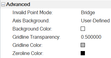
Figure 5. - Background Color
- Select a color from the palette to change the plot background's color.
- Gridline Transparency
- Numeric value that increases or decreases the gridline visibility. 0.50 is the default value. A lower value increases the gridlines' visibility.
- Gridline Color
- Select a color from the palette to change the gridline color.
- Zeroline Color
- Select a color from the palette to change the zeroline color.
- Style
- For bar plots only. Select Cluster or Stack to define how the bars are displayed.
Animation Cursor
- Display
- Sets the animation cursor display type. Options include:
- Square
- Small bar
- Medium bar
- Large bar
- Custom bar - Choose the size of the bar by entering a value in the % Window height field. You can enter a value directly or use the up and down arrows to choose a value.
- Coordinate marker
- Use Curve Color
- Sets the animation cursor color to that of the curve that the animation cursor is on.
- Use Curve Style
- Changes the line style of the animation cursor (solid, dashed, and so on) to match the curve’s style.
- Cursor Thickness
- Select the cursor thickness by choosing one of the five line style options.
- Style (Bar Chart only)
- Select Cluster or Stack to define how the bars are displayed.
Labelling (Bar Chart)
- Label Visibility
- Select to display the value labels on the bars.
- Contribution Label
- This option is only available if Label Visibility
is selected. Select one of the following options:
- Hide
- Hides the contribution label.
- Show Value
- Displays the contribution label as a value.
- Show Percentage
- Displays the contribution label as a percentage.
- Label Format
- Select Auto, Scientific, or Fixed from the drop-down menu.
- Numeric Precision
- The number of decimal points to be displayed. Select a number from the drop-down menu.
- Label Font Settings
- Click in the field to display the Font Selector dialog to edit the label's font type, style, and size.